Details
-
Suggestion
-
Status: Closed
-
Resolution: Won't Do
-
R2.3.1
-
None
-
None
-
None
-
-
1
Description
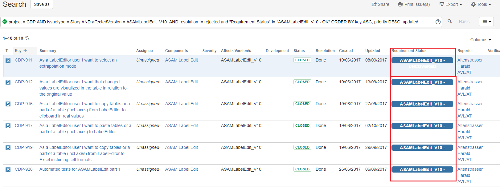
When the content of the requirement status is long, it is not clearly readable.
If the row is selected, it is hardly readable (first red highlighting), for the other rows it is not readable at all. Please check the screenshot in attachment.
Improvement idea:
Increase height for background dynamically to content.