Details
Description
Problem Statement
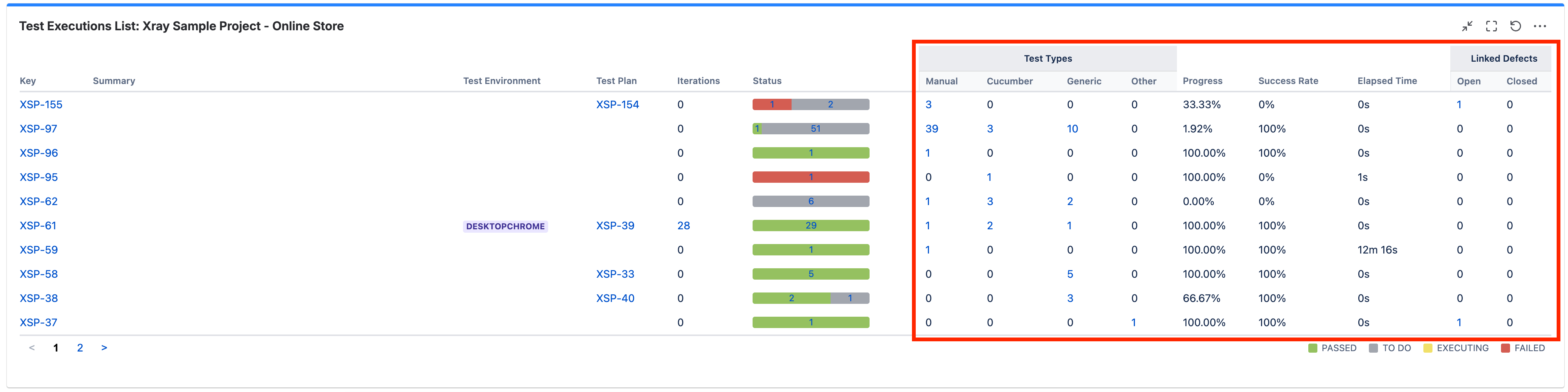
In several Xray gadgets and reports (e.g. Test Executions List), all columns positioned to the right of Status are permanently displayed and cannot be customised.
This results in a crowded and noisy UI, especially for teams that do not rely on metrics such as Test Types breakdown, Success Rate, Elapsed Time, or Linked Defects for day-to-day decision-making.
Customers frequently want to:
- Focus on a small subset of core fields
- Remove or replace columns that are not relevant to their workflow or audience.
- Tailor views for different use cases
Currently, this is not possible, as these columns are fixed and always rendered.
Impact
If column customisation were available:
- Reports and gadgets would become clearer, faster to interpret, and more usable.
- Teams could adapt views to different stakeholders without exporting data elsewhere.
- Dashboards would scale better for large and enterprise customers, where clutter becomes a major usability issue.
- Overall perception of polish and flexibility in Xray reporting would improve.
This directly impacts:
- QA Leads & Managers consuming dashboards daily
- Enterprise customers with complex test setups and large datasets
How Customers Solve This Today
- Exporting data to spreadsheets or BI tools to manually remove columns.
- Creating multiple similar gadgets/reports to partially work around visibility issues.
- Accepting cluttered dashboards as a limitation, reducing the perceived value of Xray reports.
These workarounds add friction and move users outside Xray, even though the data already exists in the product.
Context & Examples
The attached example shows a Test Executions List where every column to the right of Status is permanently displayed. Customers explicitly ask to:
- Hide unused columns.
- Swap them with other available fields.
- Keep the default view unchanged, but make it configurable when needed.