Details
-
Suggestion
-
Status: PLANNED - LONG
-
Resolution: Unresolved
-
None
-
None
-
None
-
Standard
-
-
21
Description
Description
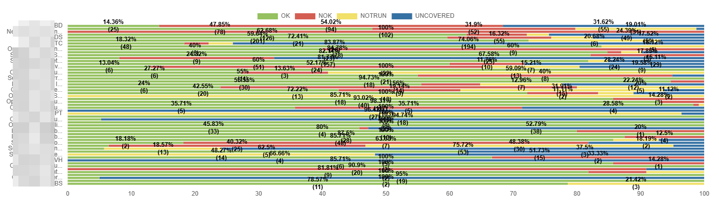
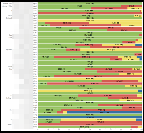
Suggesting some Improvements to address the following concerns with the usage of the Overall Test Coverage Gadget created with Group By → Components view
- Component names are truncated, and hovering over them does not display the full name, unlike in the Server version, where this works correctly. This makes the Component names of the gadget impossible to read.
- The full list of components is not visible vertically, as the height does not auto-adjust. This prevents users from viewing all components at once (unlike the Server, which expands automatically).
- Line thickness is very thin, causing text and numbers to appear merged or difficult to read.
Suggestions made now: Show the full names of the Groupby field and if that is not possible, at least hovering should display the name. Should show all the GroupBy fields at a time and increase the Bar thickness so that values are easily identifiable.
User friction:
Users struggle to identify components because the truncated names cannot be revealed. The constrained vertical list further increases scrolling/friction, and the thin lines reduce readability. Altogether, this slows down analysis and increases the chance of misinterpretation.
Steps to reproduce (right now) / Actual Result:
- Make sure that you have a lot of Components with lengthy names.
- Open the Gadget.
- Apply Group By → Components.
- Observe that:
- Component names appear truncated.
- Hovering does not show full component names.
- The component list does not auto-expand vertically (results are partially hidden).
- Lines separating data are too thin, causing numbers/text to merge visually.
IMPACT
- Users cannot identify components accurately.
- Increased time spent analyzing or validating data.
- Higher risk of selecting incorrect components due to visual ambiguity.
- Reduced usability compared to the Server version, causing inconsistencies across platforms.
What would improve if solved:
- Full visibility and readability of Component names and details.
- More efficient data analysis with less scrolling
- Consistent experience between Cloud and Server views.
Impact on stakeholders:
- Analysts: Faster, clearer interpretation of data; reduced manual effort.
- Engineering/Support teams: Fewer user complaints about readability or missing component names.
- Management: More accurate reporting and decision-making due to less user error
Current workaround: No Workaround
CONTEXT & EXAMPLES:
- In the Server, component names fully display on hover, allowing users to quickly confirm exact names.
- In the Cloud, the same components appear truncated with no hover tooltip.
Concrete example:
A component with the name: DataProcessing-Cluster-Node04-ExtendedMetrics would appear like: DataProcessing-Cl... and hovering is not helping as well.
The thin grid lines further merge numeric values visually.
Workaround risk: N/A
Attachments
Issue Links
- relates to
-
- PLANNED - LONG
-
- PLANNED - LONG