Details
-
Suggestion
-
Status: PLANNED - LONG
-
Resolution: Unresolved
-
None
-
None
-
None
-
Standard
-
-
21
Description
Description
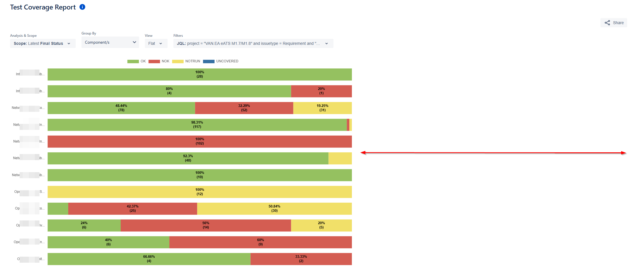
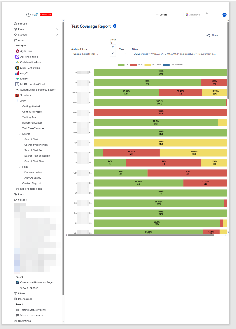
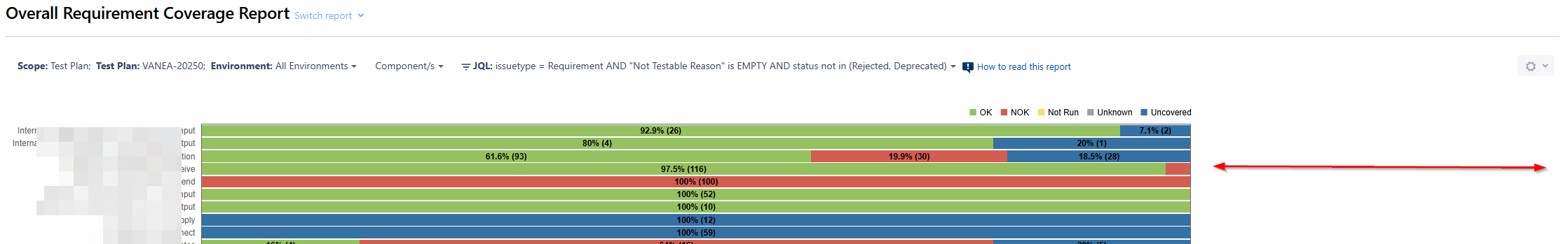
With the Test Coverage Report in Cloud, there are some issues when we produce the report with Group BY Components and there are a lot of components.
- Component names appear truncated, making it difficult for users to recognize full component identifiers.
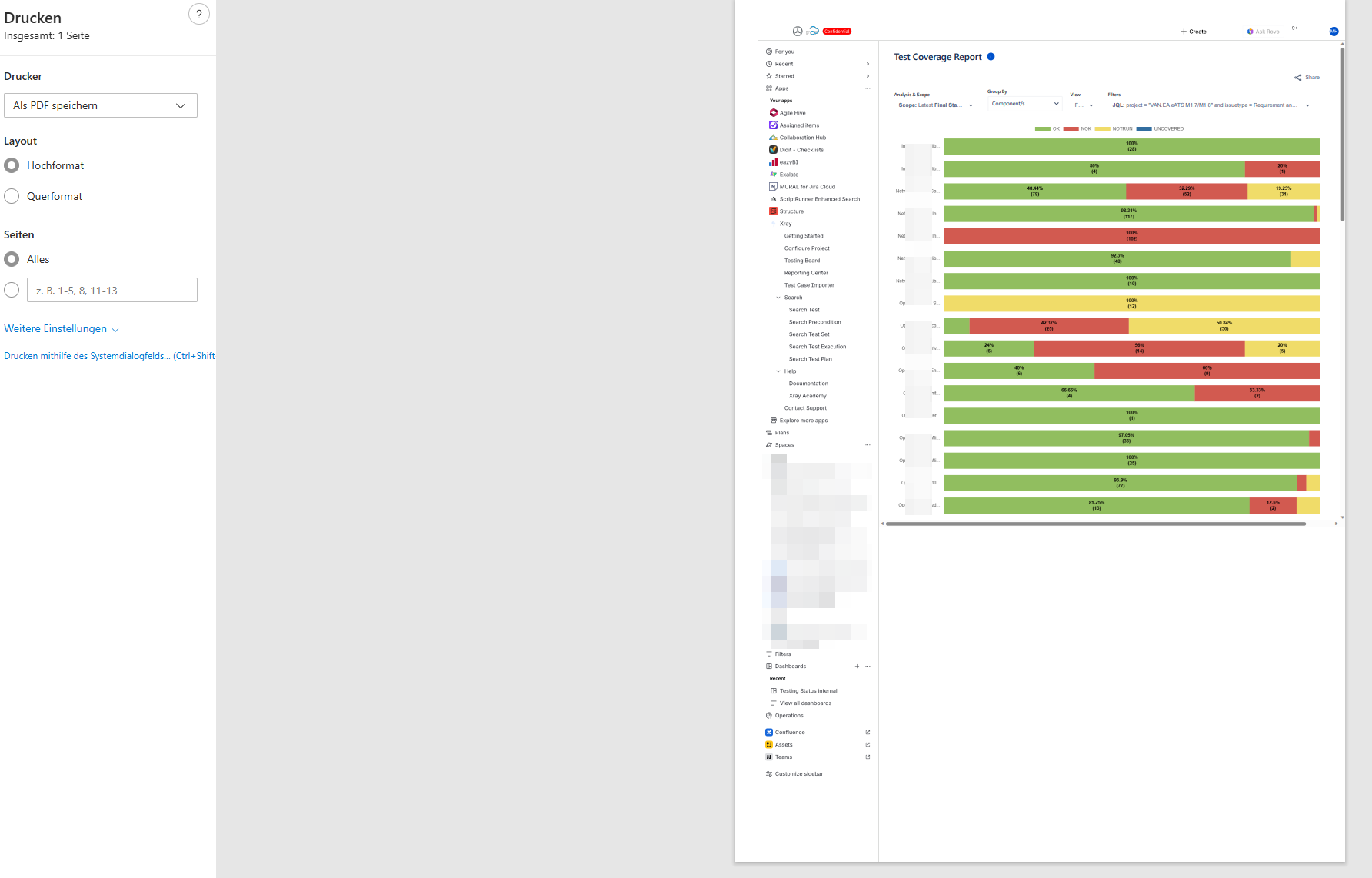
- The print preview does not display the full page, resulting in incomplete or cut-off report sections.
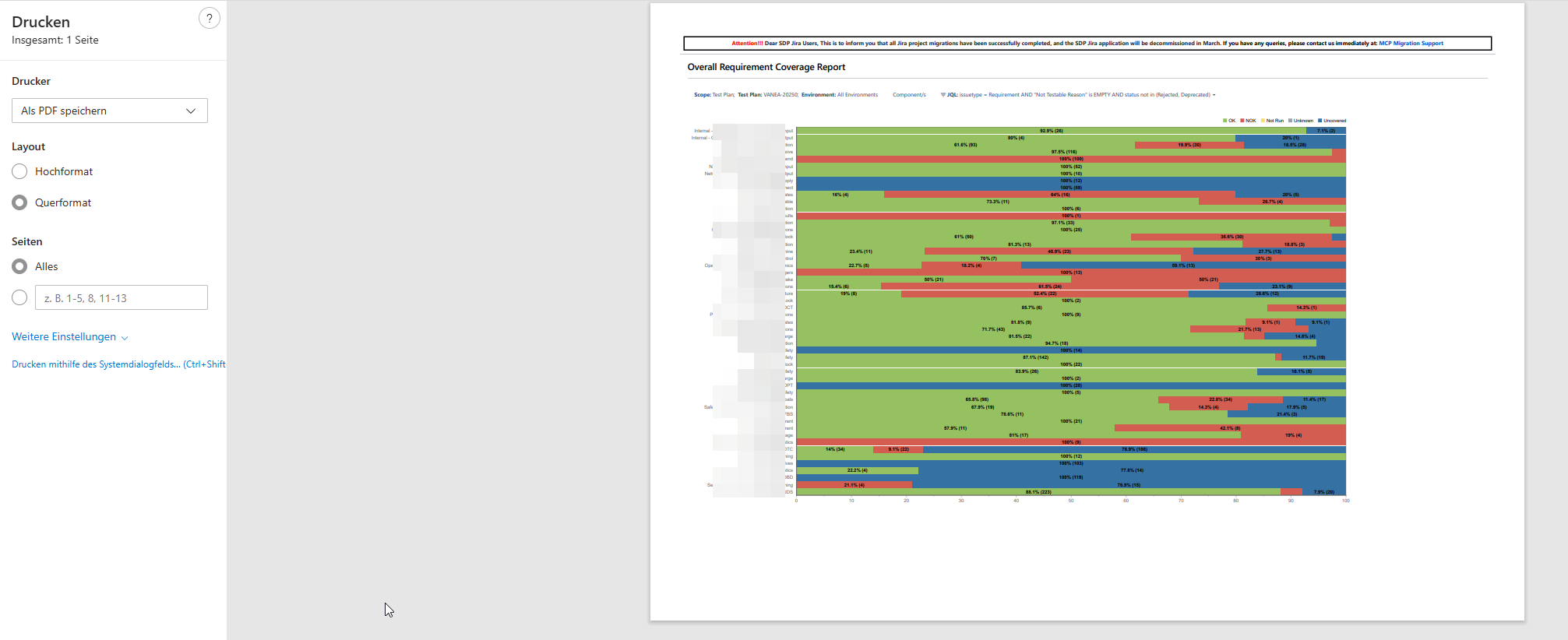
- There is excessive white space between each bar in the bar chart, causing the report layout to occupy more space than necessary. In contrast, the Server view uses compact spacing, which makes the visualization clearer and more efficient.
We need to compare the Report in Cloud and make it show data similar to work similar to Server/DC to address the above challenges.
User friction:
Users struggle to identify components accurately due to truncated names.
Printed reports become unreliable for sharing or documentation, as key information is missing.
The large gaps between bars lead to increased scrolling and reduce the efficiency of reading and comparing coverage values.
Steps to reproduce (right now) / Actual Result:
- Open the Test Coverage Report. Apply Group By → Components.
- Observe that:
- Component names are truncated without a way to view the complete name.
- Press Ctrl + P:
- The print preview does not show the full page.
- Sections of the report are cut off or missing.
- Review spacing in the report:
- Bars in the chart have excessive white space between them.
- Compared to the Server layout, the report appears stretched and less readable.
IMPACT
- Reduced clarity and accuracy when analyzing test coverage by component.
- Difficulty sharing printed reports for reviews, audits, and collaboration.
- Scattered layout due to unnecessary vertical spacing.
- Inconsistency between the Test Coverage Report in Cloud and the same in the Server display
What would improve if solved:
- Full visibility of component names for clear identification.
- Reliable and complete printouts for documentation and review processes.
- Compact bar spacing that matches the intuitive Server layout.
- Improved readability, reducing scrolling, and enhancing data comparison.
Impact on stakeholders:
- Better quality printed reports for reviews and planning.
Current workaround: No Workaround
CONTEXT & EXAMPLES:
- The Test Coverage Report introduces large gaps between bars, reducing information density and forcing extra scrolling.
- Ctrl + P printouts from the report omit sections of the visual, while Server prints capture the entire chart cleanly.
- Names of the components are truncated.
Concrete example:
A component with the name: DataProcessing-Cluster-Node04-ExtendedMetrics would appear like: DataProcessing-Cl... and hovering is not helping as well.
The thin grid lines further merge numeric values visually.
Workaround risk: N/A
Attachments
Issue Links
- relates to
-
- PLANNED - LONG
-
- PLANNED - LONG